Monday, August 27, 2007

$10 Sale and Design Review

Wishless - Threadless, Best T-shirts Ever

First of all, I'm kinda sad that the sale was now because I was hoping for some shirts that I wanted reprinted to be printed before the sale, but it won't happen. Anyways, it still didn't hold me back from buying shirts today, haha. Here are the reviews for the new shirts.

Anthill Trap
To tell you the truth, this one is kinda lame. I know, that sounds harsh, but it looks like a dirty rainbow and the ants look a little copy-and-pasted, if you know what I mean. It got a pretty nice score tho and I wasn't there to vote for it, so I can't knock the design because it isn't really a bad design, but this is one of those shirts that won on concept more than design.

The Unseen/Unheard
This one is cool and I like how the shirt color is the color of the people outlines. The ghost things just make the shirt even better and I like this one a lot. Great detail and awesome use of transparency.

Rock the Frog
I'm not too fond of this one, but I guess it looks okay. I'm just wondering why the artist didn't do more since this was a select tee. It just seems too mediocre for me to want to spend extra on.

Everybody Loves a Yeti
Now this one is just plain funny. And it is illustrated beautifully. I'm so glad this one won because it looks awesome and the colors work very well, given it is such a simple color scheme.

UR In My Top 8
Finally, someone made a great myspace shirt. Granted, this is a subtle reference to myspace, it is a great idea and it is drawn beautifully. I just love Priscilla's work and this is just another quality design from her. Great job!

Bad Apple
Alright, I get the pun, but my question about this is ... why? Why was this printed? It is too simple and the shirt just looks too plain to me. I just don't think that this design matches the caliber design that should be printed on this site, yet shirts like this continue to be printed on a regular basis. Sigh.

Unicorn
I like this design a lot. The design has that illusion of a gradient when viewed on the shirt. I like this design very much and I think it is a great addition to the collection. I don't think I like it enough to buy it, but it is very well executed and a well deserved print. It also looks awesome on the shirt.

Stupid Raisins, Stay Out of My Cookies
I hate raisins with a passion! But this shirt is kinda weird because of how all the people on the site bash photoshopped photo designs and this one clearly looks like a picture of a cookie was photoshopped to fit the color restrictions and then a bunch of words were thrown on it. I know this is a type tee, so it shouldn't be too much of a problem since I normally don't buy type tees anyways, but I think it is kinda a cop out way of making a type tee. I'm definitely not an expert though, so for all I know, this took a lot of skill to do.

Amazon Addiction
I ADORE this shirt! I love how this isn't just a normal Tetris based design, but one adapted to nature. I also love how the pieces don't show every little line in it, which makes this one even more unique to a regular Tetris design. All-in-all, I think I might get this design for my mom because she is obsessed Tetris.

Grave of the Fireflies
This is just another example of someone that won because of complexity in their design. This design just doesn't appeal at all to me. I don't know what it is. Maybe its the color scheme or all the clashing styles of each thing in the drawing. I also see this halftone halo that I just see as overused in this design.
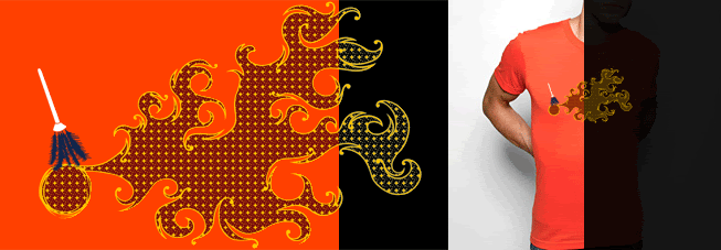
Wishless
This is just an incredible design. I am so jealous at somni's talent. I would buy this, but as much as I love the design, I can't see myself wearing it. I like the concept a lot, but I just don't think it will look good on me, but that is personal preference. Anyways, this is still my favorite out of all the new prints this week.

Stupid Cupid
This one is hilarious. Cupid is a bad shot, haha. This one is a well deserved win and it is drawn very well. This is an example of where using a pattern in the background works very well with the simplicity of the rest of the design.

Catonaskateboard
This one just annoys me. It is just so, for lack of a better term, ... ugly. I am definitely turned off about the expression on the cat's face and it just makes me want to poke my eye out. And the text for this is just horrendous. Sorry to completely bash this design, but I think it was a poor decision to even consider printing this one.

Strength in Numbers
After the cat one, anything looks better, haha. Actually, this one is quite good. I like the concept a lot and it is designed exceptionally. I really like the addition of the angler fish as the eye. Very clever and great print!

I'm not even going to review the reprints because I can't keep track of what was reprinted. Hopefully my reprint requests are granted next Monday so I can get the shirts I've been waiting for. Lately, I haven't been buying new shirts and have been buying more older shirts because I see a trend in the new designs where less and less of them are compelling me to buy them. A lot of them are great art but not necessarily for t-shirt design. This is just my opinion though, I am sure I will buy some new designs, but I checked my closet and I have only like 2 shirts that were purchased on the week they were printed (1st edition)

Thursday, August 23, 2007

Design Promo

Surface Integration - Threadless, Best T-shirts Ever

Here is my latest sub for all you geeky types. It involves Surface Integration which is a Calc III topic. I thought it was a fun thing to learn and decided to make a shirt of it. Go check it out!

Monday, August 20, 2007

New Prints!!!

Carnie Nightlife - Threadless, Best T-shirts Ever

This week has some good (and some not-so-good) prints.

Carnie Nightlife
This one is just one of those breakthrough shirts. When I saw this one up for scoring, I immediately knew that threadless would print it. The idea of having a hidden design is just incredible!

Grandma Clock
This is just creepy. I think it is drawn well, but drawn very creepily. I don't think it was a bad choice to print, I just think it is, well, creepy.

Butterfly Fish
At first, I thought this was just another butterfly shirt, but then I saw the fish and immediately knew why this was printed. Great job on the print and the design!

Quack Attack
This is funny and I think it was extremely done well. The only thing is that I think halftones are a little played out now as everyone keeps using it in their designs. Someone needs to make a new shading method. Maybe I will, hmmm.

Polar Gardening
This is okay looking, but every week, there is always some cutesy print like this. I like the white "rainbow" thing, but there's a halftone again. I think it is just a mediocre design.

The Great Outdoors
This is a good style, but I don't like the muted colors on it. It could be better, but I feel like it isn't something I would buy.

Make Yourself At Home
This design is just great with the complexity of it. I like how awesome it looks on the shirt and how detailed it is by design. Nice choice!

The reprints are ok, but none are that appealing. I'm lazy today, so I kinda slacked off on these reviews. Hopefully next week is a sale or something.

Design Review (Purple Rain Edition)

The Alumni peeps made a contest called Purple Rain where the theme is to make a design utilizing the color purple. Here are my reviews on all the ones up for scoring right now.

Halt! Who Goes There? - Threadless, Best T-shirts Ever
$5 This is my favorite of all the Alumni Purple Rain submissions. It is just so well illustrated and really has a good concept as well. Props for making purple look good.

Ride Love - Threadless, Best T-shirts Ever
2 This shirt design is just okay, but the colors don't really work well with the purple in my opinion. Nice try tho

Psychedelic Smoke - Threadless, Best T-shirts Ever
4 I love the complexity of this design and how it still sticks to stingerstyler's unique style. I hope this gets more recognition than it is getting right now, although I still kinda think its missing something.

everyone's a hero - Threadless, Best T-shirts Ever
3 The drawing is really good, but I think this could have been done better. The colors are a little dull and the placement is kinda weird. I don't know why people use off center placement so much. There is a time and place for it and I think this design would have been better had it been centered.

The fall of the Chain Letter Gang - Threadless, Best T-shirts Ever
$4 This one is another great design from kaloyster. The detail is brilliant for only 2 colors and I can definitely see myself purchasing this one if it looks good on the shirt. Nice job again!

When rhythm arrives... - Threadless, Best T-shirts Ever
3 This was dropped early and I kinda understand why, but this should have at least had a chance to get the whole 7 days. The design isn't like a normal text shirt as the outline they used is pretty well done. I don't like when people fill in letters for no reason, but at least this one filled in only o's, which showed it had a reason.

Mystic Rain. - Threadless, Best T-shirts Ever
4 I like how this one looks and how it is so huge on the shirt. The drops remind me of the designs on bandanas. Nicely done, although the presentation is kinda too slow where you have to wait so long to see the whole design.

Just Before The Purple Rain - Threadless, Best T-shirts Ever
5 This one has one of the mose incredible use of pattern and the purple looks amazing. I like the detail and this looks like it took a while to do. Nice work!

Sunday, August 19, 2007

Design Review

Spam myth - Threadless, Best T-shirts Ever
This is a great example on where concept overshadows design. The design is lacking, but the concept is so brilliant that I can't give it less than a $5. Great job and I really wish the best on this design.

World Wide Connection - Threadless, Best T-shirts Ever
This is one of the most creative uses of the world map that I've ever seen. To top it off, it is drawn extremely well. I really hope the winner of the GMail contest is something super incredible if this one doesn't win it.

Thursday, August 16, 2007

T-Shirt Review

FrequenCity - Threadless, Best T-shirts Ever

This is my first actual shirt review. By that, I mean that I actually purchased this shirt and I am reviewing how it looks in real life. This shirt impressed me so much to start up a new review type. Anyways, even though this is a reprint, I honestly believe that this looks absolutely incredible on the shirt. The huge-ness of it is amazing and it looks great when wearing it. I especially like how the design has that bright blue in it that has such a contrast when actually wearing the shirt. The design is just perfect for a shirt as well and when I received it in the mail today, I was excited to see how large the print actually was. I think threadless made an excellent decision in printing this shirt and reprinting it as well. To think that I actually gave this design a 1 when it was up for scoring that it would be one of my favorite shirts. I don't know what I was thinking! Thank god threadless didn't listen to my score, haha.

Self Promotion

The Hollywood Sign - Threadless, Best T-shirts Ever

This is my latest design called The Hollywood Sign! I really am satisfied with how this one turned out, although it isn't getting that much attention from the voters. It is a take on all the Hollywood action and dramatization in movies and stuff tied with the all too famous Hollywood sign. I really like how this turned out and honest to say, I don't really care how this scores as long as I felt that I had fun making the shirt.

Wednesday, August 15, 2007

Design Review

The Penrose Baby - Threadless, Best T-shirts Ever
Of course tomburns does it again. This time, he comes out with this ingenious design of a baby stacking blocks in the shape of one of those impossible triangle things. Optical illusion and optical appeal. All around, another great design.

The Awakening - Threadless, Best T-shirts Ever
The detail on this is just superb! I especially like the hugeness about it on the shirt. I don't know if I'd wear it, but it definitely is a great design.

CONGRATULATIONS! You have won a lottery!! - Threadless, Best T-shirts Ever
I thought this one was cool. The idea of popups (the most annoying ones as well) is pretty good, but one thing I kinda find not that good about the subs in the GMail contest is that a lot of people think the contest is about the internet, but it is actually about "Connect"-ing which can be related to many more things besides the internet. Still think this design is great tho.

Sing to the Tune of Nature - Threadless, Best T-shirts Ever
I just love the colors in this design and the concept. The concept of Nature and music is not foreign to me as I myself have submitted a design called Nature's Music (and I have another in the works, Nature's Music II). But yeah, I love the use of all the music symbols and the way the staves are not parallel. This is just an all around eye-appealing design.

Tuesday, August 14, 2007

Designer Spotlight - Haddadapillar

Haddadapillar has some pretty good work so far. With only 6 subs, he has been doing really well score-wise. His most recent sub I particularly love:

robolove - Threadless, Best T-shirts Ever

This sub is just great and I love the color and illustration. I definitely see that printabiliy quality in this designer and I really hope he gets some prints in the future, which I do not doubt.

Visit his site here.

Design Review

I'm a Phoenix - Threadless, Best T-shirts Ever
I just love this design for some reason. I know that it lacks the intricacy and detail of a lot of the more successful designs, but this one has the funny concept and that clean look to it. Anyone that can pull off a simple design like this is ace in my book. Great work and hopefully there are some more prints from this person in the future! I mean, Hypnotic Sound was awesome!

Plugin (The ultimate time machine) - Threadless, Best T-shirts Ever
Pretty sweet pixel work on this one! What more can you expect from label? I am never disappointed by label's stuff. I think this is my favorite of the contest just because of the detail and I always love pixel art. I was about to make a shirt like this, but label beat me to it, and even did much better than I ever would. I also love how the connections are not just straight, but have those little intricate weaving details to them. I also like all the little electronics references.

You can't judge a book by it's snake-skinned cover - Threadless, Best T-shirts Ever
This shirt design is IN-credible! I absolutely love the detail and the way this turned out. And finding a model for the shirt with a snake in the photo is just the clincher right there. I really have a great feeling about this and I know it will be printed. Almost 50 comments with under 500 scores? That is a key indicator of printworthiness!

Monday, August 13, 2007

New Subs Reviews

Messages From The Reverse - Threadless, Best T-shirts Ever

This week's prints are not bad. I was kinda hoping for a sale, but I'm still feeling one. Anyways, here's the lowdown.

Looking for Love in All the Wrong Places
This shirt is really fun and I think it has a great appeal to kids. The illustration is great and the use of negative space is well done.

A Birth Day
I think this one is funny, but I think it isn't that good enough to have been printed. It is one of the better designed one of its type, but I still don't really like how this was printed this week.

Messages From the Reverse
This is my favorite from this week. I like the illustration and how it looks on the shirt. I'm not particularly fond of the purple version, but I'm a guy, so I don't have to worry about that. Really nice work and great job for only a 2.32 score.

Skip Dessert
Yeah, congratulations to the winner, but I don't think this should have been printed. It isn't even that well illustrated and I've heard people say "skip rope" but I always refer to it as jump rope. I just think there should have been some other shirt or maybe even another reprint or something besides this shirt.

Pense Pas BĂȘte
This is nice looking, but I don't know how it will appeal since it is all in Spanish (or Portuguese?) and I think it won't be easy to understand if you can't read it. I still think it was designed well though.

Beasts and Pearls
This is a nice drawing and I like the detail on this, but I don't really like how it looks on a shirt. I'm glad threadless is printing lower scored shirts though. This gives me hope for some of my designs, haha.

The reprints this week were both good ones too. Glennz is just classic and always good to reprint. So I think Defend the Kingdom was a great choice to reprint. And FrequenCity is just a great shirt. I probably will buy it, as I tend to buy reprints more than new shirts.

Saturday, August 11, 2007

Design Reviews

Field of Friends - Threadless, Best T-shirts Ever
I have high expectations for this sub. I hope it does very well and that there is a future print involved. I really like the illustration and I know I can't draw people that well, so this is really well done. The only criticism is that the blue sky looks a little weird, but I still gave this a $5.

T Forest Guardian - Threadless, Best T-shirts Ever
This is great. The detail is amazing and the colors are not bad. I think this will be another future print. Keep it up dude!

Girl From Mars - Threadless, Best T-shirts Ever
This one, I like a lot. I don't see why it isnt getting too much attention from the voters, but I think this is very well illustrated and very well done. This definitely should score high and if it does not, it is a shame. Great work and hopefully this goes well.

I want to catch that... - Threadless, Best T-shirts Ever
This is a fantastic illustration. I like the way that he made the background. It is sort of like a halftone, but prettier. I think this designer is very promising and I see another print for this person. Great job!

Thursday, August 9, 2007

Design Review

Symphony in Life - Threadless, Best T-shirts Ever
This is so far one of my favorite GMail Loves submissions. The theme of the design is brilliant with the use of celtic knots as said in one of the comments. I like the colors as well. This is a $5 in my book

We can make it - Threadless, Best T-shirts Ever
This one is cool and definitely fits the theme of the contest. I really like the illustration as well and the use of color in this one. Honestly, how come iotadial has no prints yet?

Self Promo

Stardust - Threadless, Best T-shirts Ever

Here is my newest sub called Stardust. It utilizes the glow ink that some people have in their shirts. I think it looks cool and I hope you do too. Go check it out!

Here are the color options. Right-click them and select view image to see the entire image

Wednesday, August 8, 2007

Design Reviews

Makin' Breakfast - Threadless, Best T-shirts Ever

I think this is absolutely incredible and the drawing is done well, yet simple. I was just watching Top Chef and I honestly can see the chefs on the show just start throwing stuff and having a good time. This is just a shirt about having a good time and I love it.

The Last Nudists of Troy - Threadless, Best T-shirts Ever

This one is just too funny. The illustration is on point and very well executed to be a first sub for this user. Top notch work and the future looks promising for this designer.

Provider McServer - Threadless, Best T-shirts Ever

As usual, adam antium continues to dish out gorgeous work and this is no exception. I especially like how the content in the speech bubble things kinda are offset and poke out of the bubble so that it is something different. I think this is just an all around good design.

Self Promotion - Nature's Message

Nature's Message - Threadless, Best T-shirts Ever

Here is my latest submission called Nature's Message. It is supposed to be like an oil spill that makes a skull shaped spill in the water. Unfortunately, people are already starting to be rude and call out my design, so I'm just not going to deal with that and just leave the sub to its fate. I won't comment at all on my own sub because of the rude comments that I am getting already.

Tuesday, August 7, 2007

Designer Spotlight - beesneak

This designer (beesneak) has caught my attention recently and I don't understand why he has been getting such crappy scores. His last few subs are just amazing and I think he has potential on this site to make some incredible designs. I am looking forward to a few prints from him, as one of his subs was already reviewed previously by me. Keep it up dude! I want to see a print from you!

Subs and My School Schedule

Alright, so here are the subs that have caught my eye from today. I didn't have a chance to score every single sub like I used to do, but I will get back into that habit soon. I will be on this blog occasionally during the school year, but I do have 18 credit hours that will haunt me throughout fall semester. Anyways, here are the subs. I gave each one a $5

A Simple Explanation - Threadless, Best T-shirts Ever
fatheed is one of my favorite designers on Threadless and I think he has the most potential on the site with already 5 prints within a year. This one is no different. The clever idea of having aliens on the field making the crop circle is great and very well illustrated. The colors are amazing too and the look of the pushed down crop looks so good. I really see a winner in this design.

Asparagus Maximus - Threadless, Best T-shirts Ever
This is a really great design to be this user's first submission. The illustration is great and the concept is funny as well. I see a lot of potential prints for this user already.

She Giveth, She Taketh - Threadless, Best T-shirts Ever
Now I have loved Kojima's work ever since he started on Threadless. This shirt is no exception. The drawing is just nice and I see subs based on their difficulty in creation and let me tell you that this is something that is not that easy to create with all that detail. Nice presentation too. Great job dude!

Not another Dogfight - Threadless, Best T-shirts Ever
This one really caught my attention today as incredibly drawn. I like the use of the subtle background detail and how it blends with the rest of the design. Very well done and the detail is just ace.

Undergoing Maintenance

Well, threadless is undergoing maintenance right now. This kinda makes me wonder if the submissions that are up now will still get their 7 days of voting. I know that one time the site was undergoing maintenance, my sub still continued to count down in days, so it did not receive the same amount of attention as a normal sub. I guess it isn't that big of a deal, but I hope they are making the site even smoother. And the new store looks like it will be awesome! I should go visit with my friend that goes to Chicago every year.

Monday, August 6, 2007

Today's Shirts

Bad Reception - Threadless, Best T-shirts Ever

This week is my first week of review. I think that the shirts printed for this week are pretty well done. I especially like Bad Reception because of the awesome illustration. Here is the low-down:

X-Ray Goggles Work
Very creative idea on this shirt. I didn't have a chance to score this one before because of my recent break from threadless, but I think it is a great addition to the threadless collection.

The Young Explorers Society
I love the feel of this design. It is really well done and a well deserved print. The shading technique is great as well.

Bad Reception
As I stated earlier, this is my favorite of the week. I like how the cloud in the background looks, especially on the shirt. Plus the illustration is incredible!

There's No Crying in Breakfast
Now this one, I do not like. We've seen enough food-with-faces on this site, granted this one is illustrated pretty well. But I don't understand how the thought of dead milk interests so many people. I congratulate the designer, but I think there are many other designs out there that have been overlooked.

The Swirl of the World
This shirt features one of the most incredible use of linework that I have seen on this site. I really am glad that this was printed and would like to see more of this.

Never Take Your Abilities for Granted
Now this one, I just don't get. Why? I just don't see what appeal this has to put on a shirt. I don't want to question threadless' decision making, but I think that this didn't require that much work to do. It does work well as a kids shirt though, I have to say.

Still Life With a Van
Now I love this one a lot. The buildings are drawn very nicely and for some reason, I just love the random van in the design. A+ in my book.

Now for the reprints.
Mourning Girl is a classic and I believe that it is great that threadless reprinted something from back in the day to show the new members what they missed out on. But I believe that We're Toast should not have been reprinted. It probably was one of the very first fwf designs, but I think something else should have been reprinted just because on the fact that the crying cereal bowl was also printed today.

Anyways, there's my take on the week's prints. Hopefully there's a sale coming up soon that I can buy a new wardrobe for the upcoming semester.